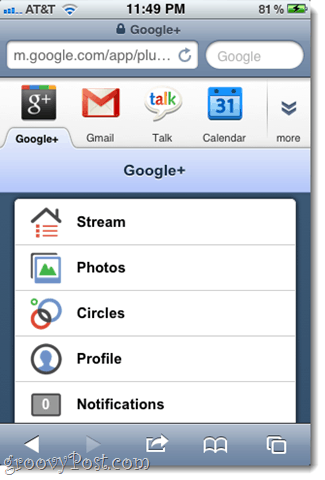
But I know you’re all dying to take a sneak peek, so I figured I’d show you around. I first got my invite while I was away from my computer, so my first experience with Google+ was on my iPhone. Even though it’s just a web app that lives inside Safari, it looks great, I must say. Here’s the home screen. I know the new Google navbar along the top isn’t exclusive to Google+ but I love it anyway. (Plus, it really lets it sink in how much of your stuff Google is now in charge of…)
The profile screen has three tabs: About, Posts and Photos. About shows your Google Profile, which, if you’re cool, you’ve already set up long ago. Posts is the same as your Facebook wall and Photos is derived from your Google Picasa Web Albums.
If you’re looking at someone else’s profile, you can see their chat status. Touching their name takes you to the Google Talk gadget or Gmail. Here’s where all the action is: the Stream screen. I declare this a million percent better than Google Buzz.
If you swipe left, you get the Nearby stream, which is pretty neat. I’ve always thought this feature was underutilized in things like Yelp and Twitter. I hope it becomes a busy back-channel for wherever I am (e.g. “Anyone know where the bathroom is in this place?” or “Hey, who dropped a Honda key on the Southside trail?”).
If you swipe right, you see the Incoming stream, which includes updates from people who have added you but you haven’t added them back. That’s a nice anti-spam feature that’s an improvement upon how Twitter handles (or doesn’t handle) unsolicited mentions. It’s also a good way to check to see if there’s anyone out there that you meant to add to a circle but haven’t yet. You can also narrow down your stream to a specific circle.
You can check-in or add location data to your posts. You can also quickly choose who you share your posts with. “Your circles” is the default, but you can also pick and choose which circles see it or set it to public, which even allows chumps without Google+ to see it.
P.S. When I first saw what Google came up with for my location, I was like, “Pssh that’s not where I live. Silly Google!” But then, I realized that I was near the back wall of my house which is adjacent to an alley which I apparently didn’t know the name of until just now. Yikes. The notifications screen is self-explanatory.
So, that’s about all there is to see on the iPhone version of Google+. More Google+ screenshots to come, including Google+ desktop screenshots and screenshots of the native Google+ Android App. Got any questions about the exciting new Google+ social media hub? AMA. Comment Name * Email *
Δ Save my name and email and send me emails as new comments are made to this post.


